Thursday, February 17, 2011

The Marriage of Luxury and Performance

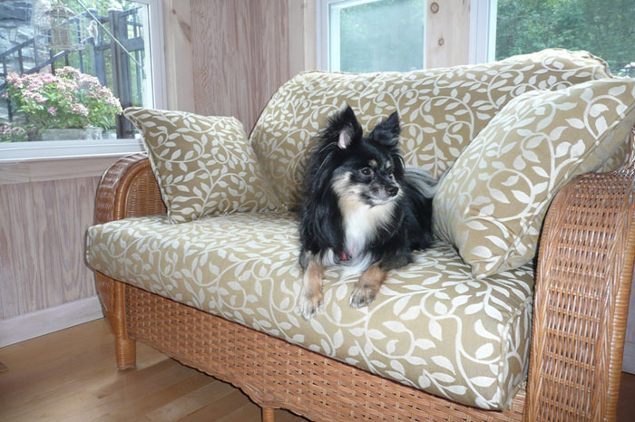
Chella is a brand of textiles that seems to truly provide Luxury and Performance.  They claim that they cater to Pool, Spa and Active Living.  This would include households with pets and children who can cause a lot of wear and tear on your fine fabrics.  They hold up equally as well under the hot sun and in the pouring rain for hotel guest or in you own backyard.  Next time I am near one of their showrooms, I look forward to feeling the luxury of these performance fabrics.  Meanwhile, here are some photos to exemplify their diversity:

Rain or shine


For all of those "oops" moments- like a sticky sucker!


Able to withstand some puppy love


All photos provided by Chella

Monday, February 14, 2011

Happy Hearts Day

I hope you all are celebrating the love in your life today and have happy hearts! 

I would love to send each of you this beautiful bouquet made up by my favorite local Sacramento florist, Arden Park Florist, but you will have to be satisfied with this photo of it :)

I will impart some great news for all the bloggers out there:  Holly Becker of Decor8 blog is now accepting students for her online blogging class called "Blogging Your Way".  I was a part of the class a year ago and found it so helpful.  Please go check it out and learn as much as you can from this talented blogger!  Registration starts today and the class fills up fast.

Happy Valentine's Day!


Photo by Rebecca Ward

Friday, February 11, 2011

Chaps My Hide

The add for the Kyle Bunting company says "The extraordinary in hide" and I heartily agree.  Kyle Bunting creates amazing rugs, wallcoverings, upholstery and furniture out of hides.  I'm marveling at all of the creative applications they have come up with, especially the wallcoverings.  Bright colors and contemporary patterns are used in many products.  Take a look:


Pretty fun, right?  I'm sure it costs a fortune but I would love to specify it someday!

Images from Kyle Bunting

Tuesday, February 8, 2011

Color and Your Age

The Sherwin-Williams' magazine STIR has an interesting article you can read here entitled, "Age-Related Color Bias" which asks the question, "Are there actual age-related color preferences, or are they the result of generations of accumulated cultural and age bias?"

I have always noticed that age plays a big part in the color my clients prefer.  There are exceptions, of course, but I can usually guess what colors a client will or won't like based on their age.  Most people over 65 don't see the value of grey like I do ;)  For them, grey is a sad, dreary color reminding them of a color palette from the 30s and 40s when the Depression and war made its impact on their youth.  Most people over 30 stay away from avocado green when used with orange and yellow because it reminds them of an aunt or grandma's (or their own!) house which has been stuck in a time bubble from the 60s and 70s.

The article explores that there aren't only associations we make along the way with colors that will affect our taste at a certain age but that our psychological development will change our perception of color.  Babies and young children prefer bold stimulting primary colors, where busy and stressed adults prefer something more calming in the greens, blues and browns.

Do you like warm colors like orange and tan

Do you like something flashy and vibrant like red?

Do you prefer the crisp and cool colors of blue and green?
So let me ask you this: What's your favorite color and has it changed with age?  Mine has!  When I was young my favorite color was yellow, then purple and now grey.

 As an aside, I would like to say that an important fact to note when considering color and age is that our eyes and perception of color and the ability to see the full spectrum of color diminishes with age.  One also needs to consider what it's like for the percentage of the population who are color-blind. They will have drastically different opinions on what colors they prefer.

Photos by Rebecca Ward

Wednesday, February 2, 2011

Ironies

I can't flip past an add for Ironies in my design magazines without stopping to drool a little.  I thought I would stop by their website to see if they  had some great photos I could share with my readers and I hit the jackpot!  I just love the calm and serene look in the presentation of their elegant products.  Prepare to drool!


Images from Ironies

Monday, January 24, 2011

The Fireplace

The Fireplace is often the focal point of the room although in recent decades it has had to compete with the Television.  Fortunately, flat screen technology has allowed us to combine these locations by mounting the television to the wall above the fireplace.

I've been doing some research on updating fireplaces for a new client.  Who doesn't love to cozy up to a warm fire?  It sure helps, though, if it's an attractive fireplace even when the fire is not blazing.  I love brick but in this situation I think it's a little much.  Also, this is not my favorite style of brick.  The charred ones are not quite fitting for this living room.
So, I flipped though some of the books in my library for some inspiration.

There are so many options!


I'm toying with the ides of covering it in slate like shown in this bathroom.  It's a nice light color, yet give a lot of character.


Do you have any good fireplace redo stories or inspiration?


Photos by Rebecca Ward

Wednesday, January 19, 2011

A Study on Hanging Art

One of the most common  mistakes I see when I visit my clients houses is that the art is hung too high on the wall.  It makes it seem to me like the room is shrugging it's shoulders or raising it's eyebrows and needs to relax. 

The common misconception is that the piece of art, picture, or mirror being hung has to be evenly space between the ceiling and the table/counter/lamp/sofa it is placed above.  Maybe if your ceilings are 7'-0" high this works but generally, that type of symmetry is not the most pleasing thing for the eye to look on in the room.  If there isn't any furniture below the art, I will try to place it somewhere around 1/2 way to 2/3rd the way up the wall from the floor.  Most of the time I see the art hung around 3/4 the way up the wall.  Yikes!

As a general rule of thumb I like to hang a piece of art around 6"-10" above a table or sofa.  This will also mean that you should have the appropriate sized art.  Many work of art I see hung are great pieces but too small for the location. 

Here are some examples of properly hung art:


Take a look at your house or office.  Is the room shrugging it's shoulders?  I think it's time for some relaxation!

Photos from Nancy Pape, Inc. Model Homes
ShareThis