Showing posts with label Color. Show all posts

Wednesday, April 24, 2013

Color Spot

One of my latest projects was designing a multi-purpose sunroom.  This room functioned as a homework/play room for the kids and a home office.  The owner is a big collector of art and loves bright cheery colors.  Check out how we were able to include everything on her list of needs and wants:


Custom Bench Cushion to coordinate with custom loveseat


Photos by Rebecca Ward

Wednesday, February 27, 2013

Spring Colors

Spring is definitely starting to bud here in California.  The warmer temperatures makes everyone start thinking about new projects, change and bringing a little life back to their homes.  I was inspired but Yolo Colorhouse Paint's Trend colors they put together.
Turquoise is always a standard favorite but pairing it with some crisp white, warm melon and refreshing green creates a beautiful palette.

What colors are you looking forward to using this spring?

Thursday, December 6, 2012

2013 Pantone Color of the Year Is...


And now the moment we've all been waiting for!  Pantone has announced that the 2013 color of the year will be Emerald!
via
This beautiful green is easily paired with other jewel tone.  It has a hint of blue and Pantone has shown some great color ideas pairing it with periwinkles and ocean blues.
via

via

via

via
I know green is not for everyone.  Does it work for you?  May this green is a forshadow that there will be more green in our wallets??  Let's hope so!  Go green!

Images via Pantone

Tuesday, September 11, 2012

Color Seasons

Each December, Pantone publishes its color of the year, which I usually am prompt to report.  They also release each season's colors.  Pantone mostly dictates to the fashion industry but there is usually a quick trickle down into interior and home fashions.  The colors we see in our fashion magazines we also want to see in our shelter magazines and on the shelves of our stores.

I recently took a look at the Fall colors to see an overview of what is currently showing now that we are already in to September and then a look at the Spring projections.  I found them to be very similar, naturally but the subtle differences do reflect the change in the season:

Fall 2012 via Pantone

Spring 2013 via Pantone
Spring has left out the browns and greys and has a more crisp yellow and blue tones.

Do you pay close attention to the seasons' colors or do you stick to your favorites?

Tuesday, August 28, 2012

White Hot

White Hot Interiors
I have been very attracted lately to "white hot" interiors and photos.  Bright Whites with saturated indigo and fuchsias.  The contrast of hot and cold colors is very refreshing, bright and cheerful.  A cool splash in the pool on a scorching day. 

I remembered that I had this book by Tricia Guild.  While this book is over 10 years old, I think her color principals in here are still pertinent.  White is timeless and never out of fashion.  Such beautiful, exotic imagery and text throughout the book.  The photography is captivating.  I find myself drawn to them often for inspiration or just to refresh my eyes - like sorbet cleanses the palate.
White Hot Interiors
How do you feel about "white hot" interiors?

Photos by Rebecca Ward

Friday, February 10, 2012

Color

I have been thinking about color a lot this week.  It all started on Tuesday during the IntDesignerChat, a twitter chat group that chats about different Interior Design topics every week.  Our topic this week was Color Inspiration Spring 2012 and designers were chatting a mile a minute, as usual.  Spring of course offers its own array of colors in nature every year, but we chatted on some of the trends that have been surfacing in interiors.

We all touched a bit on the color of the year, Tangerine Tango.  Some love it, some really don't.  The general consensus was that it makes a great accent.  One of the most popular mentions was the color grey.  Grey has become the favorite neutral color in the past few years, especially in more metropolitan areas.  Grey has so many subtleties and makes an excellent background for most bold colors, like Tangerine Tango.

This color report from Pantone also shows other colors that work with Tangerine Tango and we will see a lot of in fabrics and furnishings this season.
For more about what designers all over the world had do say on the topic of color, you can read the transcript of the chat here.

Photo by Rebecca Ward.  Other images via IntDesignerChat via Calico Corners.

Tuesday, December 20, 2011

Eclectic Inspirations

One of my current clients has quite a few french inspired antiques that they would like to incorporate into their new house, yet they also want to bring in a tribal/african motif.  How to marry the two?  See what I came up with for their Living Room:

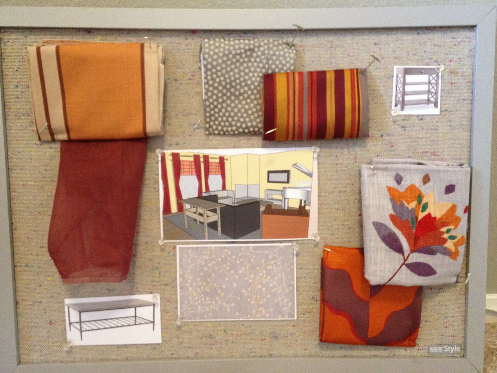
I decided to use the ever French looking Grey/Yellow and Creams palette with pops of Orange and Purple and Berry to bring in the more tribal accents which will make their presence through pillows, window coverings and artwork.  This warm and fun, yet sophisticated palette is my current favorite!

Friday, December 9, 2011

Pantone's 2012 Color of the Year

It's here!  Finally the time has come to share with you the official color pantone has chosen for 2012: Tangerine Tango!
I love it already!  I love using flashes of orange in my designs and Tangerine Tango has just the right mix of fun and sophistication. 

For the official press release from Pantone, go here.

Image via Pantone

Wednesday, April 20, 2011

Cool Sophistication

Here is a look at the presentation I was working on last week.  I love the color scheme and am thinking of incorporating it into my own home.  I already have a lot of red but I want to bring in more of the turquoise and charcoals.
The presentation went great and we're going full speed ahead with everything!  Can't wait to show you before and after photos!

Meanwhile, this week I am working away on my commercial project, a pizza restaurant and getting ready to leave for the Kitchen and Bath Industry Show in Las Vegas next week.  I know I will come back with a lot of good info for you!

Wednesday, April 6, 2011

Starting With A Blank Slate

I am so glad that things have been picking up for me and keeping me busy, however, I have been finding it more difficult to find time for my blog.  But don't worry, I have some great posts lined up for you.  Tomorrow I have a guest blogger, Kalani of Kalanicut blog that you are going to love.

Here is a look at the color scheme for the next presentation I'm working on.  I am loving this scheme the more I work with it.  My client's house is pretty much a blank slate right now with all white walls and little furniture since they have recently moved in.  I am drawing from some of the pieces they do have in colors of blacks, grays and reds to create a fun and fresh palette with vibrant red, spa turquoise, light green and charcoal/slate grays. 
I'm going to have to keep this scheme in mind when we buy our own house in a few months.
As you can see, a lot will be going on this year so I'll keep you posted!

Photo by Rebecca Ward

Monday, February 28, 2011

Weekend Color

My favorite time to look at the color of nature is in right after a storm.  Everything has been freshly washed and the light is filtered through gray clouds, the darkened sky lending a nice canvas to the colors on the ground.  I grabbed my camera this weekend to capture a few colors that stood out to me:
The palest pink of a flowering plum tree


The bright purple and yellow of potted pansies

The zesty orange of fresh picked oranges
The contrast of green ivy on red brick

The white begonias in their green bed of leaves

A freshly washed terracotta pot

I hope you are having a great Monday!  I'm looking forward to meeting with new clients this week.

Photos by Rebecca Ward

Tuesday, February 22, 2011

Trendy Renovations


Today I'm happy to bring you guest bloggers Christina Johnson & Mia Kelly who have written a very informative article about Trendy Renovations and what's happening in the remodel industry. Enjoy!

___________________________________

Contractors and homeowners are busy setting their sights on the top renovation trends for the next decade, hoping these trends will spark positive movements in real estate markets. Many of the renovation trends popular in the early 2000s are simply out of date and frankly a bit uninspired. The exterior trends need light to moderate alterations such as a fresh coat of paint in a bright new color, yet a lot of home interiors require major overhauls as kitchens and bathrooms begin to look outdated and worn.  Geographical location is important too, a trend may be just beginning in the New York real estate market area, but in the California market it could be old news.

In the last ten years, kitchen cabinets were defined by natural wood and colored melamine. Yet, the new trends in kitchen styles are not following these basic patterns anymore.
Fisher & Paykel

 Drawers: Cabinet doors are being changed for drawers that contain everything from clothes to washers and dryers! Manufacturers are designing their appliances to fit into drawers. Refrigerators, freezers, dishwashers and warming drawers will all be contained within space saving drawers. Renovations for the next decade place a high premium on saving space but also minimalism. These space saving drawers are wonderful ways to keep your busy life organized without sacrificing the aesthetic of your home.

Colors: Many modern style followers are enamored with glossy colors. Bright reds, greens, and aqua blues are the cutting edge colors for the brave and style conscious. Others still will continue to enjoy the sophisticated dark, warm, and natural colors characteristic of 2010.
Silestone

Silestone

Countertops: Granite and marble are being replaced by composite countertops. They possess the look and feel of natural stone without the worry of damage. Composite countertops are made of Zodiaq and Silestone and mixed with a synthetic bonding material. These mixed material countertops are more durable and heat-resistance than granite and come in a variety of colors.
Image from businessweek.com

Bathroom Styles
The size of bathrooms has doubled as compared to the last 10 years. This is because bathrooms are not simply bathrooms anymore. They have become multi-room, multi-purpose spa rooms, and luxury shower spaces. Tile is still the floor material of choice and can be seen on the walls and even ceilings of these luxury bathrooms.
Soaker tubs, a Japanese innovation, are large enough to stretch your legs out and high enough to completely submerge your body into the water. Other gadgets like hot air bubblers, massage your body more evenly than traditional spa tub.  The shower has split into two areas. The first area is large and glass with seats and many showerheads. The second area is an enclosed cabinet with a full steam bath. Ad to this equation a flat screen television, iPod player, and color therapy lighting and the shower doubles as a home entertainment theater.
Image from theluxehome.com

Decks
Contractors are designing decks larger and more functional. This new style deck is layered platforms that include an outdoor ecosystem complete with plants, trees, and even outdoor jacuzzis. Building decks that double as outdoor living spaces, complete with barbecue grills, fire pits, and full furniture is a new trend that is becoming increasingly popular.
Image from infotube.net

In-Law Suites
As the baby boomer generation takes on more responsibility with children and parents, In-Law suites recognize the multi-generational living situations of many families. In-Law suites are convenient solutions for long term living arrangements necessitated by the baby boomer generations’ growing care responsibilities toward their children and parents. These suites will range anywhere from 1 to 3 bedrooms often time with full bathrooms.
 ________________

Thank you Christina and Mia! 

Christina Johnson is a grad student pursuing a masters in journalism and an avid writer in her free time.  She is particularly interested in real estate, politics, and green efforts.  Her co-writer Mia Kelly works in the real estate field and also in her spare time writes articles on up-and-coming trends in home renovations easy DIY tips.

Tuesday, February 8, 2011

Color and Your Age

The Sherwin-Williams' magazine STIR has an interesting article you can read here entitled, "Age-Related Color Bias" which asks the question, "Are there actual age-related color preferences, or are they the result of generations of accumulated cultural and age bias?"

I have always noticed that age plays a big part in the color my clients prefer.  There are exceptions, of course, but I can usually guess what colors a client will or won't like based on their age.  Most people over 65 don't see the value of grey like I do ;)  For them, grey is a sad, dreary color reminding them of a color palette from the 30s and 40s when the Depression and war made its impact on their youth.  Most people over 30 stay away from avocado green when used with orange and yellow because it reminds them of an aunt or grandma's (or their own!) house which has been stuck in a time bubble from the 60s and 70s.

The article explores that there aren't only associations we make along the way with colors that will affect our taste at a certain age but that our psychological development will change our perception of color.  Babies and young children prefer bold stimulting primary colors, where busy and stressed adults prefer something more calming in the greens, blues and browns.

Do you like warm colors like orange and tan

Do you like something flashy and vibrant like red?

Do you prefer the crisp and cool colors of blue and green?
So let me ask you this: What's your favorite color and has it changed with age?  Mine has!  When I was young my favorite color was yellow, then purple and now grey.

 As an aside, I would like to say that an important fact to note when considering color and age is that our eyes and perception of color and the ability to see the full spectrum of color diminishes with age.  One also needs to consider what it's like for the percentage of the population who are color-blind. They will have drastically different opinions on what colors they prefer.

Photos by Rebecca Ward

Tuesday, December 21, 2010

A Bright New Year

My new clients that I presented to today are fast becoming favorites.  I proposed a neutral palette for their Living Room, Dining Room and Study with splashes of bright berry colors.  The scheme actually goes along well with the new Pantone Color of the Year, Honeysuckle. 
These clients made my job easy; gushing over every fabric and piece of furniture I showed them, not wanting to change a thing.  They can't wait to get started, and neither can I!  This refreshing project will be a great way to start the new year!

Thursday, December 9, 2010

Color of the Year for 2011

I'm here to announce the color of the year for 2011 as announced by Pantone today:


It's called honeysuckle and I think it an appropriately cheery color for the current economical struggles!  Go forth and be cheered!

Sunday, November 7, 2010

More Victorian

When deciding on paint colors for a house,  people usually end up sampling many colors to find the right ones.  I used the software from Dunn Edwards paints to "preview" the paint colors for the Victorian I am working on, as mentioned in the previous posting.  It's not exact but definitely helps give an idea as to how the finished product could look. It's great to have when painting patches on the wall just isn't cutting it.

Here are some before pictures with the proposed pictures to compare with. Later, I'll compare them with true "after" pictures which will look much better than these.


Photos by Rebecca Ward
ShareThis