As a designer, I am frequently specifying lighting for my clients and like to see what different vendors have to offer. I was recently introduced to Light World, which features Kichler lighting and some home accents. They have both interior and exterior, residential and commercial lighting. Since I am working on a new project requiring some more contemporary lighting I have made note of these light that might work.
Light World has recently launched a blog that has a lot of great information for the lighting consumer, including Lighting Feng Shui and the need to know about CFLs. They are definitely knowledgeable and a great source for your lighting curiosities. Be sure to stop by!
Images from Light World
Tuesday, November 30, 2010
Monday, November 29, 2010
Cyber Monday
 I hope you all had a wonderful Thanksgiving! As per usual, I went up to my family's beach house in Oregon. This time we had a nice surprise of snow one day! Not enough to stick but it was fun to watch the flurries come off the ocean. (You can rent out our beach house, if you are interested. More info here)
Today is Cyber Monday. A few ours left to save! I always forget about it until emails start arriving in my inbox. I still prefer Black Friday since on Cyber Monday I'm still trying to catch up from being out of town.
I can't believe we are nearly at December! I have a busy month ahead as I finish up a few project and have picked up a few more! Looking forward to sharing my design adventures with you.
P.S. If anyone is keeping track, I did decide to go with the green plaid bedding from West Elm. I finally picked it up and am just now putting it on the bed. Pictures to come!
Photo by Rebecca Ward
Friday, November 19, 2010
Furniture At Your Fingers
Pier 1 Imports has teamed up with SnapShop which is an app for your smart phone. Not only can you browse what Pier 1 has to offer but you can preview that chair or table in your space with the help from your phone's camera.
I played around with it this afternoon and had fun! It's free so take advantage of it!
Happy Friday!
Images from SnapShop
I played around with it this afternoon and had fun! It's free so take advantage of it!
Happy Friday!
Images from SnapShop
Monday, November 15, 2010
Cork On The Floor
I saw this cork flooring by Globus Cork in an advertisement in Interior Design Magazine and thought it was the most stunning cork floor I'd ever seen. I love the basket-weave pattern and have used it many times in tile and natural stone floors but never with cork. In fact, I don't recall ever specifying a cork floor.
Cork is a great product in that it uses recycled content and has great acoustic absorption. I never have been inspired much by cork but this floor has changed my mind. I will have to remember this for future projects.
Photos from www.corkfloor.com
Cork is a great product in that it uses recycled content and has great acoustic absorption. I never have been inspired much by cork but this floor has changed my mind. I will have to remember this for future projects.
Photos from www.corkfloor.com
Sunday, November 14, 2010
Eye On The Target
I uploaded some photos from my phone to my computer and had forgotten that I had taken pictures of these awesome throw pillows that would keep catching my eye as I passed their aisle in Target.
They are from the DwellStudio for Target line. I, of course, love the gray and yellow combo ;) I'm so predictable when it comes to gray.
Photos by Rebecca Ward
They are from the DwellStudio for Target line. I, of course, love the gray and yellow combo ;) I'm so predictable when it comes to gray.
Photos by Rebecca Ward
Monday, November 8, 2010
Learning My ABCs
I have a new favorite website: ABC home. I saw their add in Interior Design magazine and the anthropoligie-esque interior photo instantly drew me in. I just started to skim the surface of their online store and am already in love! I had to immediately share with you so you can drool along with me!
They have products not only for home but apparel too. ABC home also offers carpet and is very eco-conscious. Please hop over to their fabulous site here. You won't be dissapointed!
Images from ABC home
They have products not only for home but apparel too. ABC home also offers carpet and is very eco-conscious. Please hop over to their fabulous site here. You won't be dissapointed!
Images from ABC home
Sunday, November 7, 2010
More Victorian
 When deciding on paint colors for a house, people usually end up sampling many colors to find the right ones. I used the software from Dunn Edwards paints to "preview" the paint colors for the Victorian I am working on, as mentioned in the previous posting. It's not exact but definitely helps give an idea as to how the finished product could look. It's great to have when painting patches on the wall just isn't cutting it.
Here are some before pictures with the proposed pictures to compare with. Later, I'll compare them with true "after" pictures which will look much better than these.
Photos by Rebecca Ward
Friday, November 5, 2010
Color Change
Today my work took me outside and to downtown Sacramento where many Victorian style houses can be found. I was referred to this client for my eye for color by my painter, Dayne Beals of Infinity Paint and Restoration. He has been spending much time prepping the job, as these older homes require, and meanwhile the homeowner was having some difficulty deciding on color. It really is best to call in an expert on these types of jobs.
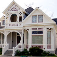
Victorians are beautiful, when they are done right. Unfortunately there are quite a few in disrepair downtown or that have been washed out in a single color, hiding all the detailed craftsmanship. Here are a few photos to give you an idea of the beauty they can reveal when a little TLC is given to them.
We came up with a pleasing and sophisticated 4-color scheme that I'm positive will translate well when it's finished.
I'll be sure to post photos once it's completed!
Photos from sac historic house blog and Easton Painting
Victorians are beautiful, when they are done right. Unfortunately there are quite a few in disrepair downtown or that have been washed out in a single color, hiding all the detailed craftsmanship. Here are a few photos to give you an idea of the beauty they can reveal when a little TLC is given to them.
We came up with a pleasing and sophisticated 4-color scheme that I'm positive will translate well when it's finished.
 | ||
| Paints are Dunn Edwards Brand |
Photos from sac historic house blog and Easton Painting
Thursday, November 4, 2010
Time For A Change
This weekend marks a change in time - falling back. I love this time change because I get to sleep in an extra hour. As it were, I think it would be best to spend that extra hour in my bed with a new duvet cover and shams. I have a gift card to West Elm and think the perfect way to spend it is to replace the duvet cover my husband and I got for our wedding 4-1/2 years ago. It's starting to show signs of wear, no thanks to our cat who has claimed ownership of one corner and has been the cause of having the duvet covered washed many times more than normal.
In light of the Interior Designer Chat that I participated in earlier this week on twitter (#IntDesignerChat), I made sure my husband had a say as to what he likes and dislikes on the choices of duvets at West Elm. I want to make sure both of us feel comfortable in the room - not overly masculine or feminine in style. I kind of felt like Goldilocks going through the selections: this one looks to college dorm, this one too country, this one too busy. My husband didn't think he could sleep under a duvet that had been described as "flowerbed."
We were able to narrow it down to these two:
My thoughts are that when we buy a house next year, this duvet will be put in the guest room and we will get another new one to go with the colors of our new bedroom (in which I plan to paint the walls gray, of course) and possibly new bed with an upholstered headboard.
Which do you like best?
Images by Rebecca Ward and West Elm
 |
| She obviously feels no remorse about the condition of our duvet. |
In light of the Interior Designer Chat that I participated in earlier this week on twitter (#IntDesignerChat), I made sure my husband had a say as to what he likes and dislikes on the choices of duvets at West Elm. I want to make sure both of us feel comfortable in the room - not overly masculine or feminine in style. I kind of felt like Goldilocks going through the selections: this one looks to college dorm, this one too country, this one too busy. My husband didn't think he could sleep under a duvet that had been described as "flowerbed."
We were able to narrow it down to these two:
My thoughts are that when we buy a house next year, this duvet will be put in the guest room and we will get another new one to go with the colors of our new bedroom (in which I plan to paint the walls gray, of course) and possibly new bed with an upholstered headboard.
Which do you like best?
Images by Rebecca Ward and West Elm
Subscribe to:
Comments (Atom)


